LEGO – Facebook Campaign

I choose to analyze the Lego campaign on Facebook. With over 12.5 million likes and over 12.4 millions users, Lego must have done something right!

The brand is the little colorful blocks that kids and adults love. They can create something basic or something more elaborate like Kylo Ren’s command shuttle (I have kids, what do you expect?). The objective is to show as many people as possible all the products that they offer, but on Facebook, Lego shares their “exclusives” with those who follow them. Lego shows the world their products, how kids interact with them and more. Lego also has their own movies and have created their own line of characters which Lego has built successful series stories around such as Ninjago and Chima.

There are a few principles that Lego seems to do well with and others that they seem to ignore altogether. The Zeitgeist and Story principles seem to be absent but there are others that seem to dominate.

One of these is the Presentation principle. Lego shares unique content and special clips to movies and their products. By doing so, Lego boosts their brand because everyone wants to see what Lego has going on. Lego chooses the cooler products over the basic ones, making them have more appeal to the public.

The Value principle plays a small part. Lego lovers can get together and discuss products or Legoland parks. They are part of a group of people, young and old that share their love of these small, colorful blocks. This in a way, spills over into the Attention principle.

Lego uses the Attention principle by inviting users to give their ideas, having contests, creating polls – all to see what the Lego fans feel. Lego fans can win items or have their ideas used. When Lego prompts this sharing, users are more willing to open up and share their ideas. People then begin to comment to one another, creating this community. The big part of this is that Lego responds to the general population, validating their ideas and thoughts.

I kind of feel that the principle of Expectations plays a small role. People expect Lego to share interesting and new items firsts to those who are likers and followers. Lego will post about a set that is due out in the future, whereas no one else in the general community knows about. Lego followers expect that they will know beforehand, otherwise, what purpose would they have to follow Lego on Facebook?

Personal Manifesto

There are so many things that I want to accomplish in life, but there are a few that really drive me to be the person I am today.

Family – I want to raise a happy and healthy family. My children are the sole reason for my existence and they mean the world to me. I can’t really explain the feeling they give me or the invisible pull that I have for them, it’s there and I can’t ignore it. It’s my number one priority to raise future decent and caring humans beings. If my family life is suffering, then all other aspects are suffering as well. I can’t be happy doing something else when in the back of my mind a family issue is festering.

Design – I want to design and write. I love beautiful things and I love things that a clean and get a message across. In fact, I would not be in the university taking the courses I am now if I was not interested.

Travel – I love, and I mean LOVE to travel and explore the world. Living all over and meeting people of different races and cultures has taught me more than any classroom ever could. I love the mountains, the sea and the grassy plains. There is something about the outdoors and people that makes me feel more connected to God.

Reverse Engineering a Social Media Post

I am an avid football fan (although maybe not so much after all this political baloney) so I  choose an ad I saw recently on the NFL’s twitter page.  It’s advertising a Thursday night game between the Bears and the Packers.

A strength of the ad is the humor it uses to connect with the viewer. The Packers are using a bear trap to show how they are going to bait in the Bears to win, and well the cheese trap for mice is to put cheese into kind of does not make sense, but the viewer can get the point. That part of the design is flawed. What would have made more sense is if they went with a mouse to show how the cheese can be devoured. Because mice eat cheese and traps don’t trap cheese.


Another weakness is just the general tweetdesign. The colors are not complimentary, the NFL logo is teeny, and you can barely see the sponsors of the game. They try to line up the teams to show them squaring off in a sense, perhaps by using the squares for the team name and bait method. One would think that the Packers are favored because a bear trap is more lethal than a teeny mouse trap.
 

At the bottom of the tweet, you can see how many comments, likes and re-tweets. Another form of measurement are the ratings of this particular game that won’t be available until after the airing of the spectacle. The NFL apparently has been experiencing low rating and this would be one way to draw attention to the game by using a funny ad. Check it out here! 


Project 4 Ideas

Here are some ideas I had when choosing a topic, and of course all are things that are currently involved in my life at the moment:

  • causes of colic in babies
  • what is a blighted ovum?
  • patients outcomes in nursing homes
  • mental effects of abortion
  • middle child effect
  • medical residency placement
  • breast fed vs formula fed
  • organic vs GM foods
  • gait patterns in babies using and not using walkers/assist toys
  • why babies appear to be rolling over later

Of course I am naturally drawn to the most controversial topic on my list, but I feel they make the best projects. I know people who are impacted by the choices they made in earlier life. One suffered many miscarriages and the loss of a child, another can’t have any children at all, one believes God is punishing her for her abortion earlier in life through miscarriages, and most regret it and do not want to come forth because they are ashamed with what they did.

These women deserve a voice, to teach others now in the position they once were to learn from the past mistakes and to not repeat them.


$100 and Food…an Infographic

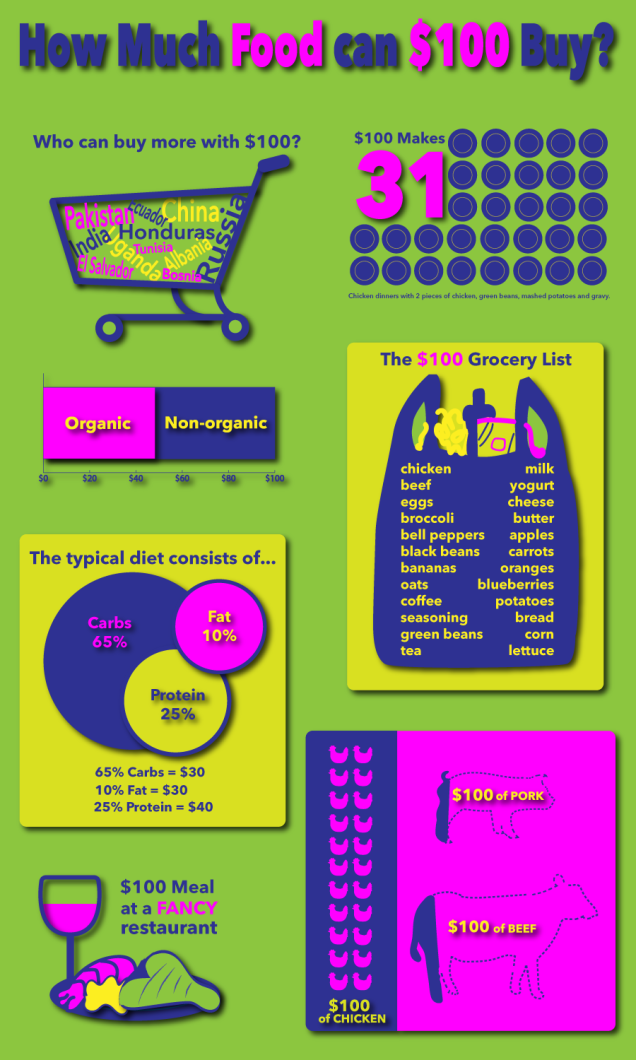
Here is my design process book for the second project of my class, as well as the final product. Please feel free to leave comments and critiques, as they are always welcome so that I can grow as a designer!

Project 2 Design Process Book

Final Product 

project2

After thought:

After completing this project and seeing the final design, I can already see where I would make changes. I have learned that there is always room for improvement. I liked how I used the drop shadow feature in the InDesign program but I think I would make the background a little less bright, possibly opting for a plain white background and eliminating the two yellow background boxes. If anything, the one behind the circles has go to go!

This project was different for me because I had to rethink  halfway through the design concept. I was not content with the images I was creating and knew something was off. It didn’t help that there was some project confusion but once that was clarified and I began to explore alternative ideas, did my project start to make sense to me. It wasn’t until then was I able to make a conducive and complete infographic.

What healthy foods can you buy for $100?

This week was a bit tricky. I was going to photograph my own foods since I already own what I wanted to put in the project, but the photos were lacking. I tried building a light box, found here, but I don’t have the time to run around looking for the items and building it. Perhaps another time.

With that idea out the door, I came up with an alternative – using individual png files to arrange on my design boards. I am hoping this works and this is what I have come up with:

I really like the look of the first one because you can get an better idea of how much food, while the others kind of show what you can get but the size is not relative. If I were to chose from the second or third, it would be the one where the foods are lined up. It just has a cleaner and more organized look to it, overall.

How to make 100?

Sounds simple, start counting, right? Not for this project! We have to come up with ways to create 100. 100 dollars, 100 beans, 100 Lego blocks, you name it. I, of course, choose how to show $100 in healthy groceries. Why did I do this to myself?

My idea is to show that purchasing groceries for healthy (not to confuse organic with healthy) eating is quite doable. People I feel have a hard time visualizing this and will often use the excuse that healthy eating is affordable. I want them to know with the $20 they just spent at McDs they could have had a delicious home cooked meal, with quite possibly leftovers.

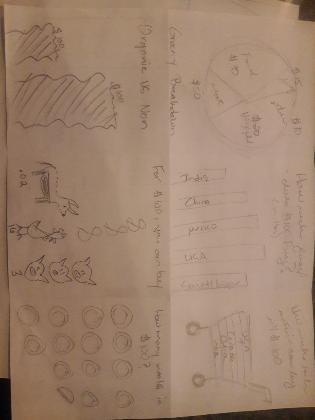
Below are some designed I have in mind. They were created on my phone while standing around at work. The first is a graph where I could divvy up small images of foods as the “bar” to show the spreading of the healthy foods over the week. While I like this idea, I don’t think it will pan out the way I have it imagined in my mind. It might also be a bit off the assignment topic, though it would still show 100.

The second idea would be $100 of healthy foods arranged into one single, image with a white background. Taking a photo of each food and then laying them out (last one) might be too much since there will be many foods and not a lot of space.

The third would be a grid, laying out all the different foods, spread out. I am not sure this is something that would even look good, but the next week will tell.


20 Ways to Visualize 100 Relating to Food : 

  1. How much $100 will buy in food
  2. 100 ways to eat food 
  3. What to eat to get 100% of you daily needs
  4. What is in a 100 calories
  5. What makes up 100 grams of fat 
  6. 100 ways to burn calories
  7. How many ways to show 100 calories in food
  8. 100 best foods to fight cancer
  9. 100 foods no one ever heard of
  10. 100 ways to cook veggies
  11. 100 ways to use fruit as decor
  12. 100 drink recipes
  13. $100 of healthy food vs. $100 of processed food
  14.  100 countries that experience food poverty
  15. 100 ways to donate food
  16. 100 ways to not waste food
  17. How to consume %100 of purchased food
  18. How to make 100 soups
  19. 100 recipes for the crock pot
  20. 100 foods to avoid

(Teal indicates 15 of the better ideas. BOLD teal indicates top 3)


Visual Research: 

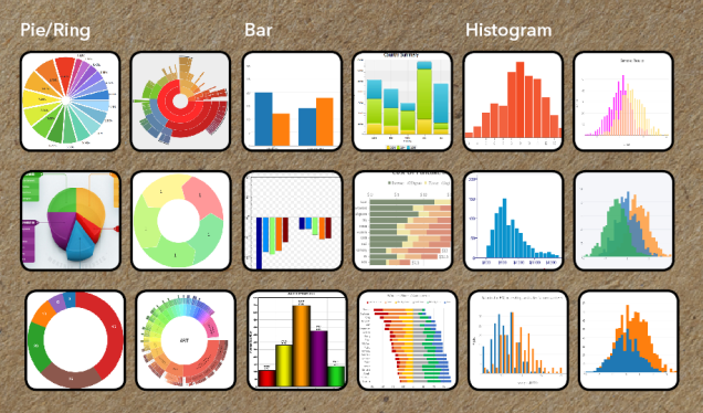
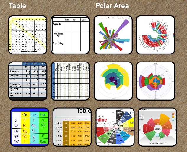
While doing research, I noticed a common theme – things were simple. Sometimes a simple shape was representing part of a whole, while others used images. Repetition also seemed to be an element.